 So I was sitting down last night frustrated with my latest newsletter, trying to figure out how to get the colors to work. Tom peeked over (after a bit of bullying him for his help) and asked if I knew that I could match the colors numerically and I was absolutely floored. OF COURSE! This is the answer! I was struggling because the colors just didn't look right, even though I thought I was using the color wheel correctly. While the colors were close, they weren't just right. The newsletter didn't pop. So, Tom rolls his chair over (I'm still parking my computer in the media room until I get my office fixed up) and offered up his mad math skills.
Seems that instead of 365 to make the wheel (as in degrees oh a compass) 8-bit color has 256 increments. So, if you pull the color using the dropped tool off the image that you want to match up, you can hit complimentary colors, tertiary colors, analogous colors, and such. It's all math from there on out. After you've “droppered” your color, you simply go into the info for that color and see what the HSL are (
O.K. A lot of jumble, but basically it means that I've found a VERY easy way to match colors! I'm sure that none of this is new info, but it certainly is like a light bulb went on in my head. This is how folks get their colors to match up perfectly every time! No wonder all those coordinated lines look so perfect - it's all just mathematical color theory! Silly me with my little color wheel sitting here like I knew what I was doing all along. The even cooler part is that this works not only for stuff on the computer, but for picking paper as well! The number are a bit different as the computer uses additive color (RGB - goes lighter as we add color) and paint uses subtractive color (CMYK - goes darker as we add color), but the theory is still the same.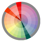
It's wild when you stumble on something so simple. It's certainly not something that was in my box, but after consultation with someone who thinks outside of MY box (in his own math box!), I pulled this little trick right in! I ended up using the Split Complimentary scheme for my newsletter, and since I was able to pull the original color right out of the logo, I knew EXACTLY what my other colors should be! WILD!
No comments:
Post a Comment